| << Chapter < Page | Chapter >> Page > |
In this section we will discuss techniques using a spreadsheet for displaying quantitative data using stemplots, histograms, boxplots and qualitative data using bar graphs and pie charts. We will primarily use Microsoft Excel and Google Spreadsheet, as we will use these two resources for sampling and surveying in this introductory course.
We will review a few techniques that you will use to create, copy and paste into a document, and save your displays of data.
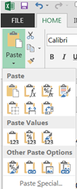
Copy and Paste 2.0: When you copy and paste information you have a few choices in Excel and Google Spreadsheet. You can copy as is or you can copy as a picture. You can paste as paste, paste values or paste other. If you copy any cell with a formula by just clicking on the copy picture it will copy the contents. If you copy using the black arrow to the right of the copy symbol you will also have the option to copy as a picture. When we copy a formula, we will copy the cell content. When we copy a graph, we will copy as a picture. The picture is then not dynamic and will always stay the same. If you copy regularly, the graph will be dynamic and any time you change or delete something in your spreadsheet it will change in your document. So graphs copy as picture; formulas copy as usual. Now for pasting you have many options. We generally use two options. Paste as formula or paste as values. If you want a dynamic formula . . . copy formula. If you are interested in making a copy of the “values” only, then paste values. If you go to the down arrow next to the paste symbol on the home tab, you can mouse over each of the pictures in the pull down menu and select the type of paste you want (see figure below). You may not see the advantage of this right now. But before you complete your project . . . you will use these techniques.

Both bar graphs for qualitative data and histograms for quantitative data involve using frequency distributions of the data. For qualitative data each bar will represent one category of data. Since the data is discrete or nominal in nature, we will be sure to represent the data with each category having its own bar. The order of the bars does not matter, but what does matter is that the bars are separated by space so that it is clear that each bar is a different category. When we work with quantitative data, we will make sure that the bars are touching (connected) since we will be working with continuous data and there is no space between the measurement-level data.
To create a bar graph using Excel, highlight the column of qualitative date that you would like to represent. Open the “Insert” tab on the ribbon and choose “Chart” in google spreadsheet or mouse over recommended charts in excel and click. A popup window with a bar chart will appear with categories and the counts in each of the categories. If it looks like you intended, then mouse over to the OK button and click (bottom right of the popup screen). Excel will create a new spreadsheet for you. Again you will want to give the worksheet tab a descriptive name. You may even want to change the counts to percent of total. If so you will use the sum of values box in the pivot chart fields, use the downward pointing arrow to bring up another pull down menu and select “Value Field Settings” (sound familiar), show values as, instead of no calculation pick percent of total, then click on the ok button. You now have a bar chart with relative frequency. Note that this was a quick way to create a pivot table and a bar chart at the same time. While you are on this page you can select the categories of your data (in the example below college rank categories) and the relative frequency column (highlight them with your mouse, next go to the insert tab in your ribbon and select recommended charts, Pie and then mouse over your OK button and you will have a pie chart on your Excel spreadsheet. You can mouse over the space provided for a title and give your pie chart a more descriptive title.

Notification Switch
Would you like to follow the 'Collaborative statistics using spreadsheets' conversation and receive update notifications?