| << Chapter < Page | Chapter >> Page > |
In this section we will discuss techniques using a spreadsheet for displaying quantitative data using stemplots, histograms, boxplots and qualitative data using bar graphs and pie charts. We will primarily use Microsoft Excel and Google Spreadsheet, as we will use these two resources for sampling and surveying in this introductory course.
We will review a few techniques that you will use to create, copy, and paste into a document, and save your displays of data.
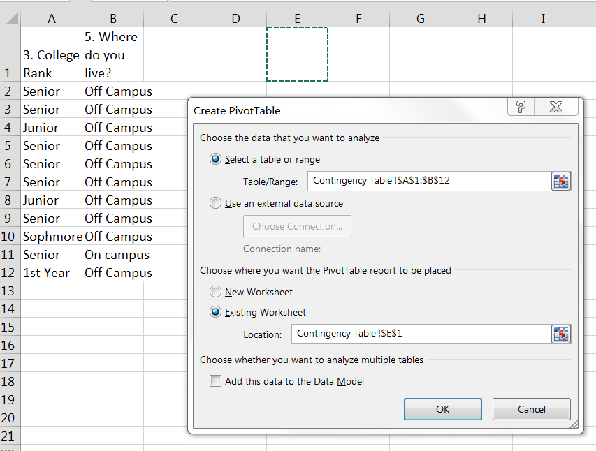
Contingency Tables: Excel - We will use pivot tables to create contingency tables. We have used them before for univariate data. This time we will highlight two columns of data to create our pivot tables. Both columns of data must be categorical. The two columns of data must be side-by-side. A good technique to use is to copy the two columns of data you want to display in a contingency table to a new labeled worksheet, side by side. The example below demonstrates that process.

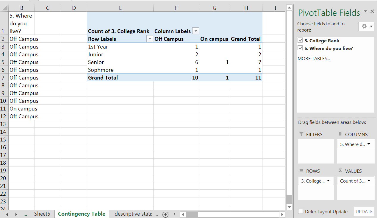
I have two columns of data in a new worksheet labeled. When I mouse over the OK button, and click, the PivotTable Fields will appear and I can use them to create a contingency table. I usually select the variable with the least number of “categories” for the columns and the variable with the largest number of “categories” for the rows. This just makes the chart easier to cut and paste into a word document. In the example below I have dragged and dropped “Where do you live?” to the “Columns” field and “College Rank” to the “Rows” field. I can then either put college rank or where do you live in the “Values” field. For this example I put college rank into the values field. I now have a contingency table. See image below. I have only the “counts” in my contingency table. The next step will be to create row or column percents.

I can now add another “college rank” to the “Values” field to create a percent field. I now have two “college rank” fields in my “Values” field. I will create percentages for either row or columns by clicking on the down arrow next to the count of “college rank” and picking “Value field setting” from the drop-down menu. When I pick “value field settings” a pop-up menu will appear and you will select the tab that says “Show Values As”, and then from the drop-down menu of “Show Values As”, select percent of column or percent of rows. For this example I have picked “percent of column” since my data is mostly off campus. I can now see that 60 percent of the students from this sample that live off campus are seniors. I can use the percents to interpret my data. Note that when I created the second “Values” field, a “Value” field was created in the “Columns” field. You don’t create this field, the Excel spreadsheet did that automatically from you creation in the “Values” field. See image below. Also note that I highlighted my titles on the actual PivotTable and then from the home tab selected “wrap text” to make my columns neater. You can experiment with other editing of the titles to get the “look” you want.

Notification Switch
Would you like to follow the 'Collaborative statistics using spreadsheets' conversation and receive update notifications?