| << Chapter < Page | Chapter >> Page > |
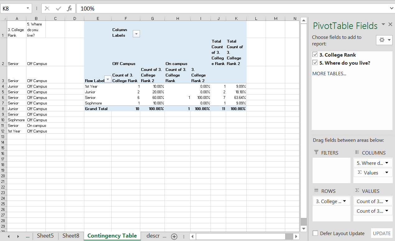
Google Spreadsheet – You can create pivot tables in Google Spreadsheet as you did for univariate data however you have the same limitations, you cannot create row or column percentages unless you create them using formula (which you can do!) The only difference here is that you will again highlight two columns of data that you want to look at in the pivot table and select one for the rows and one for the columns. See the image below. Go back to Sampling and Data to get more details on how to find the Report Editor.
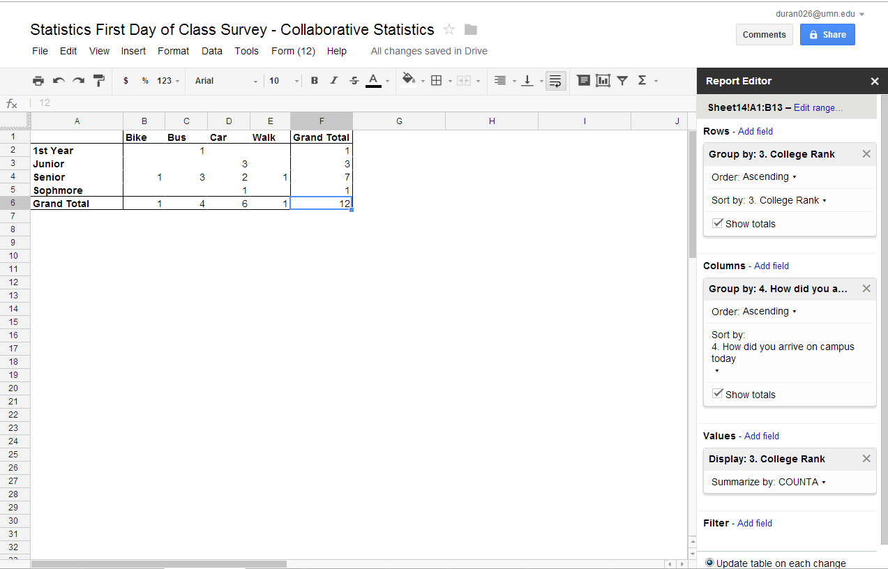
In both Excel and Google Spreadsheet, it is very easy to create side by side or stacked bar graphs directly from your contingency tables. Highlight the fields on your contingency table (note do not highlight the totals column or any of the cell highlighted “blue”) and then go to your insert tab and insert a chart. See the fields highlighted (the area highlighted grey with a green border around it) in the figure below.
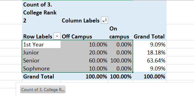
You have a choice of side by side or stacked. In Excel you can use your percentages. In Google Spreadsheet you will need to create your percentages if you want them in your bar graphs. Below is output from Excel and Google Spreadsheet. Both spreadsheet programs give you many options in the design and format modes. In Excel you can access the design you want from the Change Chart Type field on the Design Tab. In Google Spreadsheet you change chart types in the Chart editor under the start tab or the charts tab. Explore . . . it’s fun.
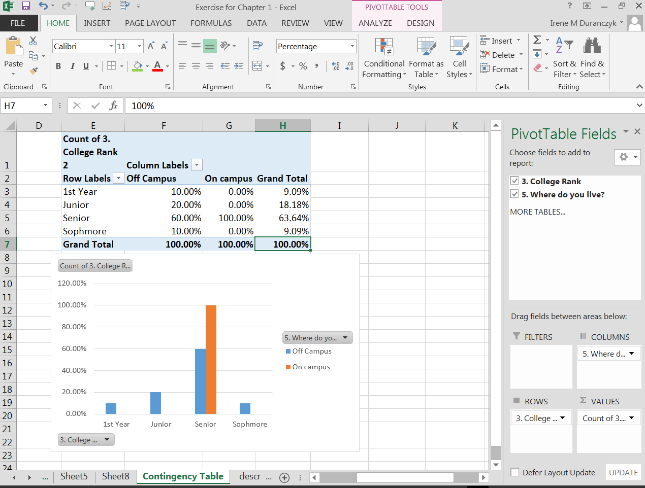
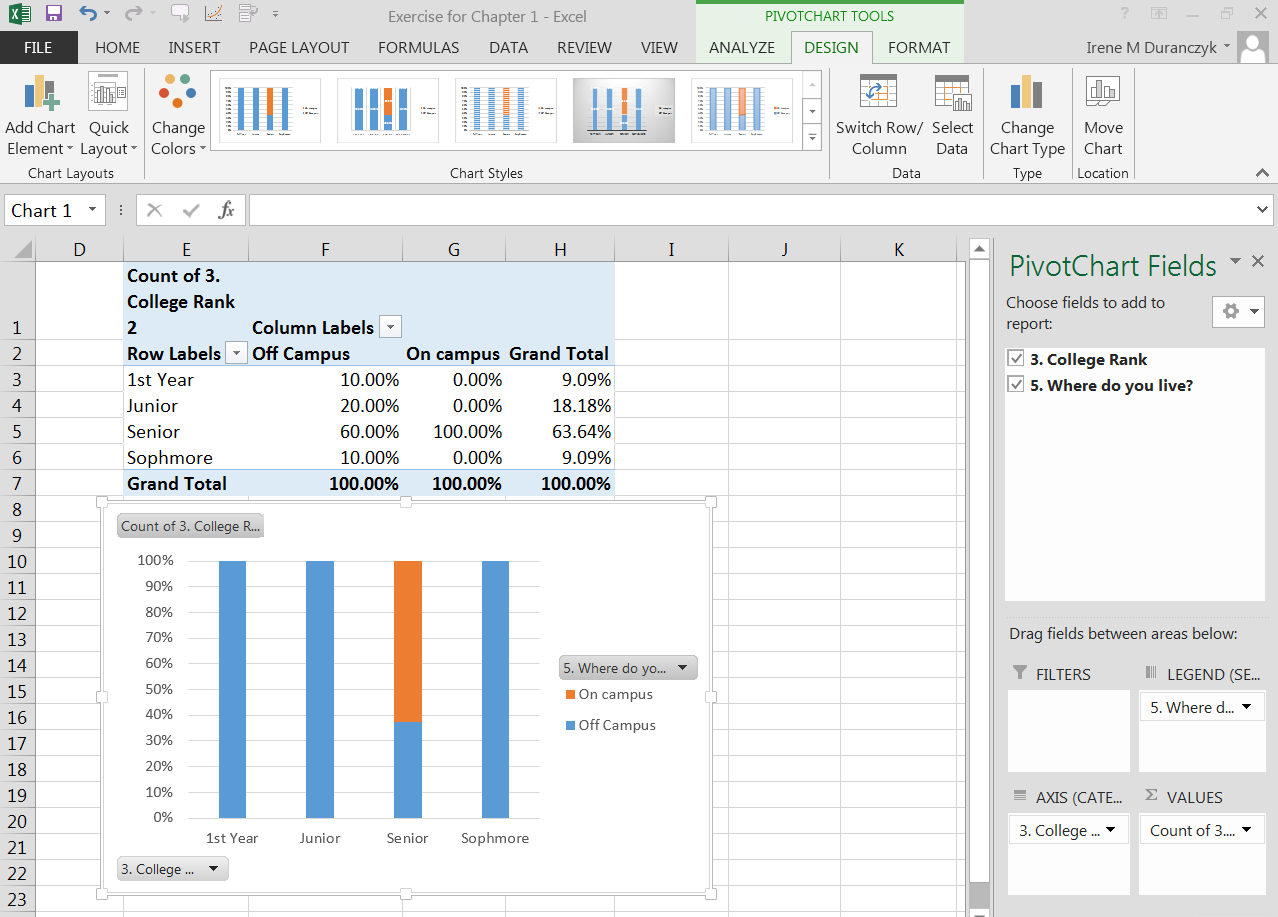
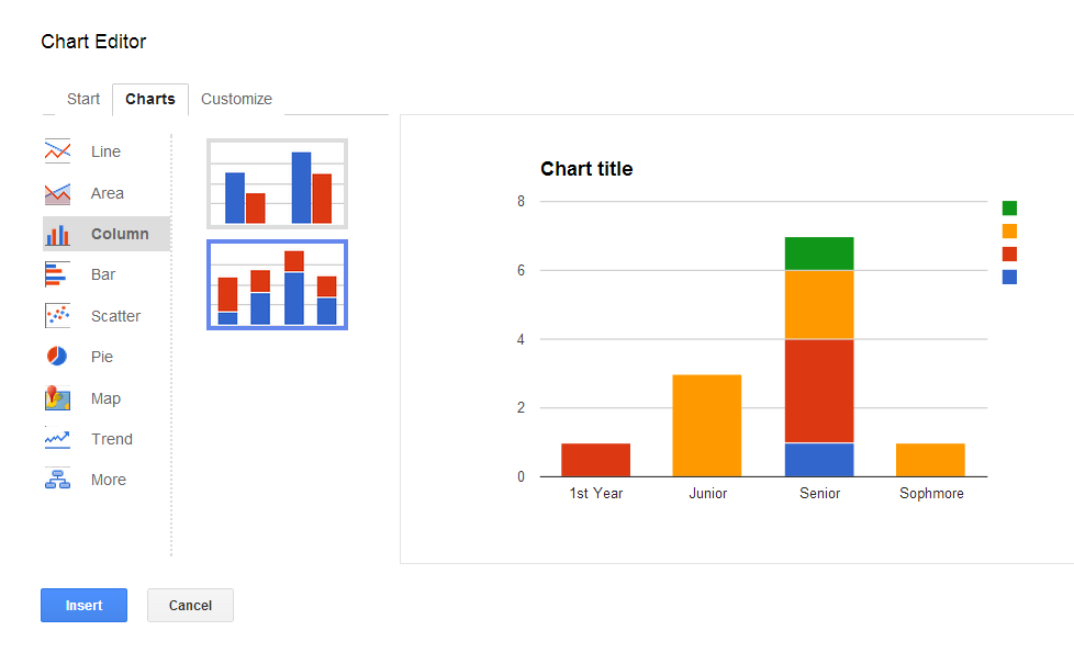
Pie charts are created the same way as bar graphs in Excel and in Google Spreadsheets using the pivot table . . . however you will need to change the order of the columns to create multiple pie charts. If you use the sort function in the PivotTable field (highlighted in green below) the field at the top of the PivotChart Fields, mouse over the down arrow, a popup menu will appear, pick a different sort option (a to z, z to a, or more sort options), and then the order of your columns will change. See Image of the popup menu below.
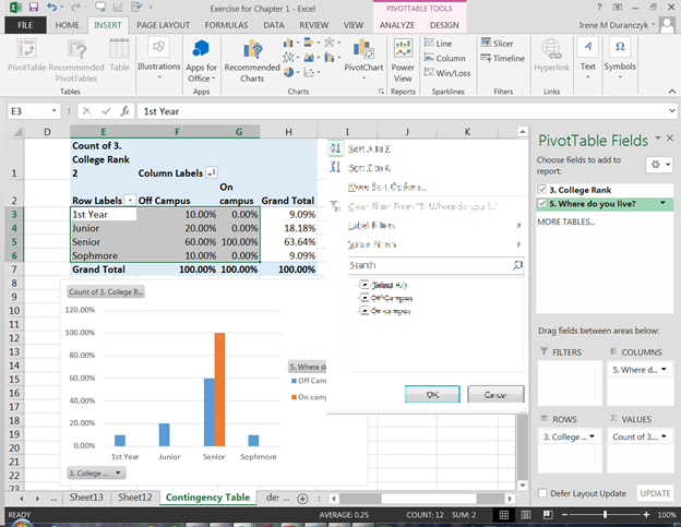
To make multiple pie charts you will need to copy the pie chart as a picture and paste it on your spreadsheet before you pick an alternative sort method. If you do not copy the pie chart as a picture, when you sort the data, you graph will change (it remains dynamic). Same is true when creating pie charts in Google Spreadsheet.
At your computer, try this exercise: (1) Open the file, Statistics First Day of Class Survey that you worked on previously (2) open the file in Google Spreadsheet or Excel; (3) create a new worksheet tab and label it Bivariate Graphs for Categorical Data; (4) pick two column of data that are categorical and has been “cleaned” and create a contingency table, side by side bar graphs and side by side pie graphs with all the appropriate labels; And (5) save the file again and post in the appropriate Moodle assignment.
When working with categorical and numerical data and Excel or Google Spreadsheet, one of the best first steps is again, to copy the columns of data from your working data sheet to a new spreadsheet, and label the spreadsheet. The next step will be to sort the data. You must be sure to sort both columns of data together. The data from the categorical column and the numerical column are related. They are a pair of data from the same source. In examining categorical – numerical data we want to know what is the relationship between the two responses, so we must keep the two columns together.

Notification Switch
Would you like to follow the 'Collaborative statistics using spreadsheets' conversation and receive update notifications?