| << Chapter < Page | Chapter >> Page > |
Before we take up the discussion of linear regression and correlation, we need to examine a way to display the relation between two variables and . The most common and easiest way is a scatter plot . The following example illustrates a scatter plot.
From an article in the Wall Street Journal : In Europe and Asia, m-commerce is popular. M-commerce users have special mobilephones that work like electronic wallets as well as provide phone and Internet services. Users can do everything from paying for parking to buying a TV set or soda from amachine to banking to checking sports scores on the Internet. For the years 2000 through 2004, was there a relationship between the year and the number of m-commerce users?Construct a scatter plot. Let = the year and let = the number of m-commerce users, in millions.
| (year) | (# of users) |
|---|---|
| 2000 | 0.5 |
| 2002 | 20.0 |
| 2003 | 33.0 |
| 2004 | 47.0 |
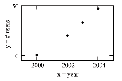
A scatter plot shows the direction and strength of a relationship between the variables. A clear direction happens when there is either:
You can determine the strength of the relationship by looking at the scatter plot and seeing how close the points are to a line, a power function, an exponential function,or to some other type of function.
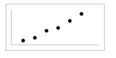
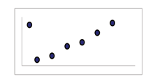
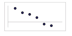
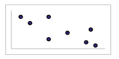
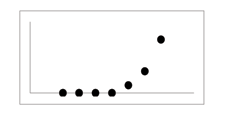
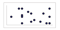
When you look at a scatterplot, you want to notice the overall pattern and any deviations from the pattern. The following scatterplot examples illustrate these concepts.
Positive linear pattern (strong)
Linear pattern w/ one deviation
Negative linear pattern (strong)
Negative linear pattern (weak)
Exponential growth pattern
No pattern
In this chapter, we are interested in scatter plots that show a linear pattern. Linear patterns are quite common. The linear relationship is strong if the points are close to a straight line.If we think that the points show a linear relationship, we would like to draw a line on the scatter plot. This line can be calculated through a process called linear regression . However, we only calculate a regression line if one of the variables helps to explain orpredict the other variable. If is the independent variable and the dependent variable, then we can use a regression line to predict for a given value of .

Notification Switch
Would you like to follow the 'Elementary statistics' conversation and receive update notifications?