| << Chapter < Page | Chapter >> Page > |
The two sinusoids above the center had higher frequencies than the sinusoid in the center, with the sinusoid at the top having the highest frequency. For afixed sampling frequency, the sinusoids above the center had fewer samples per cycle than the sinusoid in the center. The sinusoid at the top had the fewestnumber of samples per cycle.
The two sinusoids below the center had lower frequencies, than the sinusoid in the center, with the sinusoid at the bottom having the lowest frequency. Thetwo sinusoids below the center had more samples per cycle than the sinusoid in the center. The sinusoid at the bottom had the most samples per cycle.
In the final analysis, what really counts is not the number of samples per second of the sampling frequency, or the number of cycles per second of thesignal frequency. What really counts is the number of samples per cycle of the highest frequency component. This value is established by the combination of the signal frequency and the samplingfrequency.
Because the plots in Figure 1 are pure sinusoids, I can mathematically determine the values between the samples. However, if there had been theslightest amount of random noise superimposed on the sinusoids, (which is the more realistic situation), I would have no way of knowing the values between the samples. Thus, all of the information that I have about these five signalsis contained in the heights of the vertical bars shown in Figure 1 .
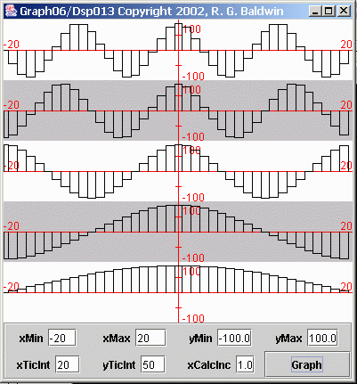
As mentioned earlier, we often find ourselves estimating the values in between the samples. One way to do this is shown in Figure 2 , which shows a different graphical treatment for the same five sinusoids.
| Figure 2. Rectangular representations of samples from five sinusoids. |
|---|
 |
Figure 2 represents each of the sample values as a rectangle. In effect, this treatment estimates that there is no change in the value of the analog signalfor half a sample interval after the sample is taken. Then the value of the analog signal jumps to the value of the next sample.
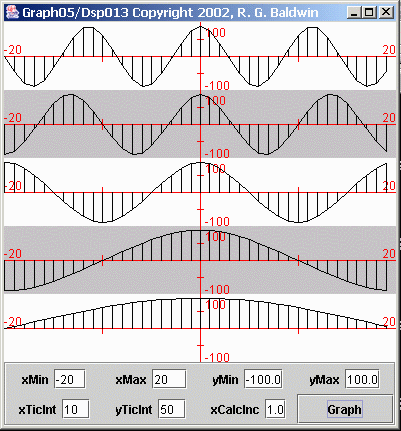
Now consider the graphical treatment for the same five sinusoids shown in Figure 3 .
| Figure 3. Trapezoidal representations of samples from five sinusoids. |
|---|
 |
Figure 3 shows a more common representation of the data. Figure 3 treats each sample as a trapezoid consisting of a rectangle and a right triangle. Thetriangle sets atop the rectangle and connects each sample value to the next with a straight line.
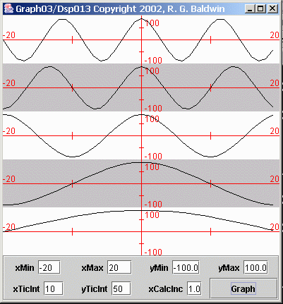
Now consider the most common representation of the sampled data, as shown in Figure 4 .
| Figure 4. Most common representations of samples from five sinusoids. |
|---|
 |
Figure 4 shows the most common representation of the sampled data. Figure 4 is the same as Figure 3 except that the vertical lines that identify the sides of the trapezoids have been omitted. In Figure 4 , each sample value is connected to the next sample value with a straight-line segment.

Notification Switch
Would you like to follow the 'Digital signal processing - dsp' conversation and receive update notifications?