| << Chapter < Page | Chapter >> Page > |
While the differences between the pulse shapedsequences in [link] and [link] are apparent, it is difficult to see directly whether the distortions are serious; that is, whether they causeerrors in the reconstructed data (i.e., the hard decisions) at the receiver.After all, if the reconstructed message is the same as the real message, then no harm has been done, even if thevalues of the received analog waveform are not identical. This section uses a visualization tool called eye diagrams that show how much smearing there is in the system, and whether symbol errors will occur.Eye diagrams were encountered briefly in Chapter [link] (refer back to [link] ) when visualizing how the performance of the idealized system degradedwhen various impairments were added.
Imagine an oscilloscope that traces out the received signal, with the special feature thatit is set to retrigger or restart the trace every seconds without erasing the screen. Thus the horizontal axis of an eye diagram isthe time over which symbols arrive, and the vertical axis is the value of the receivedwaveform. In the ideal case, the trace begins with pulses, each of which is a scaled copy of . Then the st to th pulses arrive, and overlay the first , though each is scaled according to its symbol value. When there is noise,channel distortion, and timing jitter, the overlays will differ.
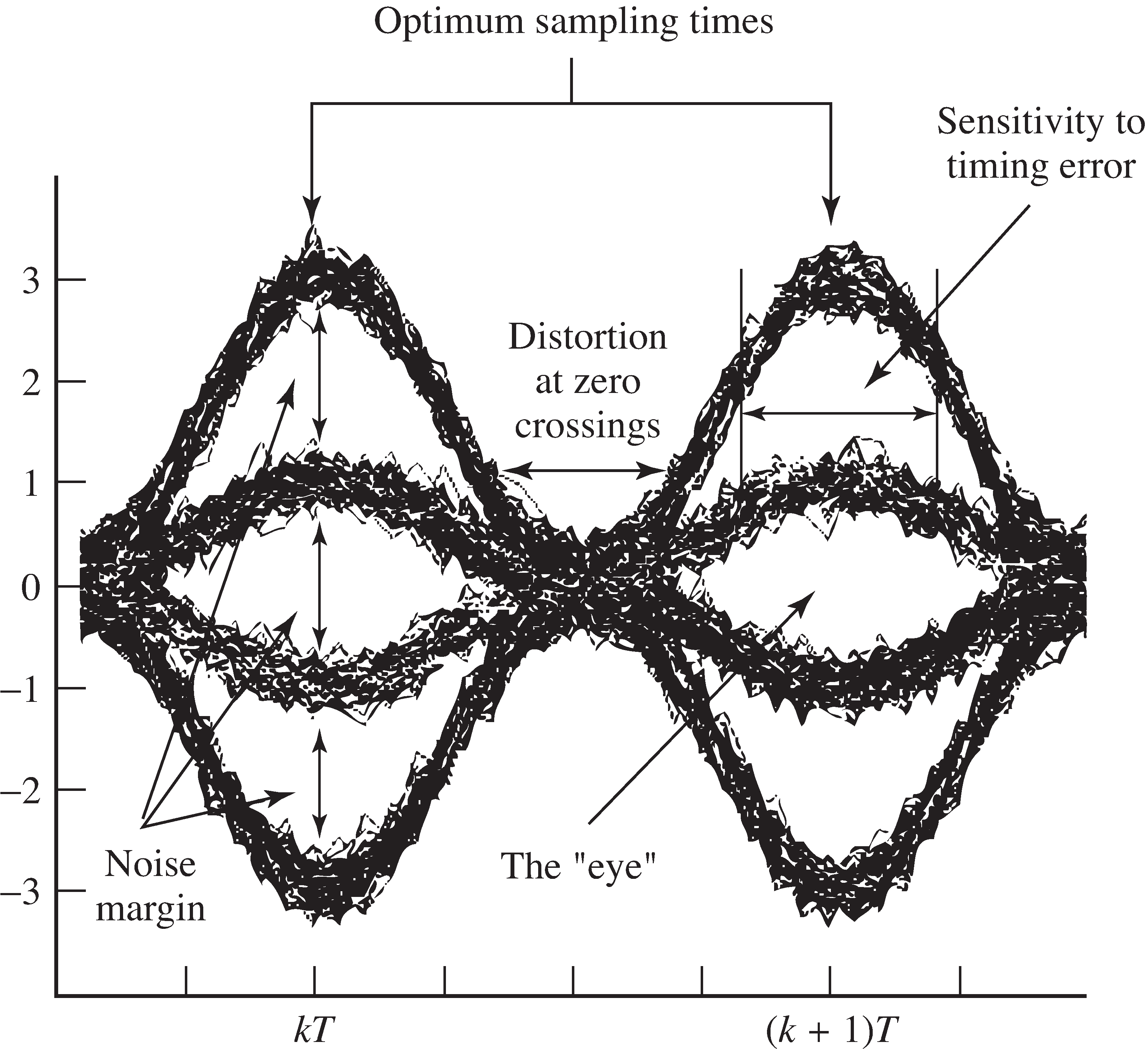
As the number of superimposed traces increases, the eye diagram becomes denser, and gives a picture ofhow the pulse shape, channel, and other factors combine to determine the reliability of the recovered message.Consider the symbol eye diagram shown in [link] . In this figure, the message is taken from the 4-PAMalphabet , and the Hamming pulse shape is used. The center of the “eye”gives the best times to sample, since the openings (i.e., the difference between the received pulse shape when the data value is and the received pulse shape when the data value is 1, or between the received pulse shape when the data value is1 and the received pulse shape when the data value is 3) are the largest. The width marked “sensitivity to timing error”shows the range of time over which the samples quantize correctly. The noise margin is the smallest vertical distance between thebands, and is proportional to the amount of additive noise that can be resistedby the system without reporting erroneous values.

Thus, eye diagrams such as [link] give a clear picture of how good (or how bad) a pulse shape may be.Sometimes the smearing in this figure is so great that the open segment in the center disappears. The eye is said tobe closed , and this indicates that a simple quantizer (slicer) decision device will make mistakes in recovering thedata stream. This is not good!
For example, reconsider the 4-PAM example of the previous section that used a triple-wide Hamming pulse shape.The eye diagram is shown in [link] . No noise was added when drawing this picture. In the toptwo plots there are clear regions about the symbol locations where the eye is open.Samples taken in these regions will be quantized correctly, though there are also regions where mistakeswill occur. The other plots show the closed eye diagrams using -wide and -wide Hamming pulse shapes. Symbol errors will inevitably occur, even if all else in the system is ideal.All of the measures (noise margin, sensitivity to timing, and the distortion at zero crossings) become progressivelyworse, and ever smaller amounts of noise can cause decision errors.

Notification Switch
Would you like to follow the 'Software receiver design' conversation and receive update notifications?