| << Chapter < Page | Chapter >> Page > |
To build a useful macroeconomic model, we need a model that shows what determines total supply or total demand for the economy, and how total demand and total supply interact at the macroeconomic level. This model is called the aggregate demand/aggregate supply model . This module will explain aggregate supply, aggregate demand, and the equilibrium between them. The following modules will discuss the causes of shifts in aggregate supply and aggregate demand.
Firms make decisions about what quantity to supply based on the profits they expect to earn. Profits, in turn, are also determined by the price of the outputs the firm sells and by the price of the inputs, like labor or raw materials, the firm needs to buy. Aggregate supply (AS) refers to the total quantity of output (i.e. real GDP) firms will produce and sell. The aggregate supply (AS) curve shows the total quantity of output (i.e. real GDP) that firms will produce and sell at each price level.
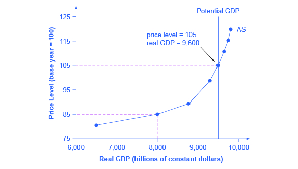
[link] shows an aggregate supply curve. In the following paragraphs, we will walk through the elements of the diagram one at a time: the horizontal and vertical axes, the aggregate supply curve itself, and the meaning of the potential GDP vertical line.

The horizontal axis of the diagram shows real GDP—that is, the level of GDP adjusted for inflation. The vertical axis shows the price level. Remember that the price level is different from the inflation rate. Visualize the price level as an index number, like the GDP deflator, while the inflation rate is the percentage change between price levels over time.
As the price level (the average price of all goods and services produced in the economy) rises, the aggregate quantity of goods and services supplied rises as well. Why? The price level shown on the vertical axis represents prices for final goods or outputs bought in the economy—like the GDP deflator—not the price level for intermediate goods and services that are inputs to production. Thus, the AS curve describes how suppliers will react to a higher price level for final outputs of goods and services, while holding the prices of inputs like labor and energy constant. If firms across the economy face a situation where the price level of what they produce and sell is rising, but their costs of production are not rising, then the lure of higher profits will induce them to expand production.

Notification Switch
Would you like to follow the 'University of houston downtown: macroeconomics' conversation and receive update notifications?