| << Chapter < Page | Chapter >> Page > |
The familiar demand and supply diagram holds within it the concept of economic efficiency. One typical way that economists define efficiency is when it is impossible to improve the situation of one party without imposing a cost on another. Conversely, if a situation is inefficient, it becomes possible to benefit at least one party without imposing costs on others.
Efficiency in the demand and supply model has the same basic meaning: The economy is getting as much benefit as possible from its scarce resources and all the possible gains from trade have been achieved. In other words, the optimal amount of each good and service is being produced and consumed.
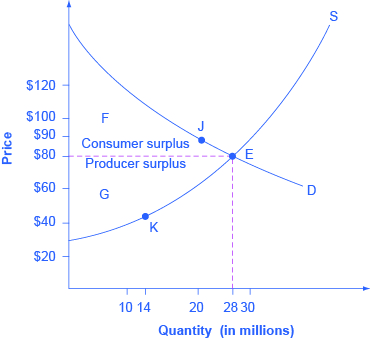
Consider a market for tablet computers, as shown in [link] . The equilibrium price is $80 and the equilibrium quantity is 28 million. To see the benefits to consumers, look at the segment of the demand curve above the equilibrium point and to the left. This portion of the demand curve shows that at least some demanders would have been willing to pay more than $80 for a tablet.
For example, point J shows that if the price was $90, 20 million tablets would be sold. Those consumers who would have been willing to pay $90 for a tablet based on the utility they expect to receive from it, but who were able to pay the equilibrium price of $80, clearly received a benefit beyond what they had to pay for. Remember, the demand curve traces consumers’ willingness to pay for different quantities. The amount that individuals would have been willing to pay, minus the amount that they actually paid, is called consumer surplus . Consumer surplus is the area labeled F—that is, the area above the market price and below the demand curve.

The supply curve shows the quantity that firms are willing to supply at each price. For example, point K in [link] illustrates that, at $45, firms would still have been willing to supply a quantity of 14 million. Those producers who would have been willing to supply the tablets at $45, but who were instead able to charge the equilibrium price of $80, clearly received an extra benefit beyond what they required to supply the product. The amount that a seller is paid for a good minus the seller’s actual cost is called producer surplus . In [link] , producer surplus is the area labeled G—that is, the area between the market price and the segment of the supply curve below the equilibrium.

Notification Switch
Would you like to follow the 'Openstax microeconomics in ten weeks' conversation and receive update notifications?