| << Chapter < Page | Chapter >> Page > |
Use the following data (first exam scores) from Susan Dean's spring pre-calculus class:
| Data | Frequency | Relative Frequency | Cumulative Relative Frequency |
|---|---|---|---|
| 33 | 1 | 0.032 | 0.032 |
| 42 | 1 | 0.032 | 0.064 |
| 49 | 2 | 0.065 | 0.129 |
| 53 | 1 | 0.032 | 0.161 |
| 55 | 2 | 0.065 | 0.226 |
| 61 | 1 | 0.032 | 0.258 |
| 63 | 1 | 0.032 | 0.29 |
| 67 | 1 | 0.032 | 0.322 |
| 68 | 2 | 0.065 | 0.387 |
| 69 | 2 | 0.065 | 0.452 |
| 72 | 1 | 0.032 | 0.484 |
| 73 | 1 | 0.032 | 0.516 |
| 74 | 1 | 0.032 | 0.548 |
| 78 | 1 | 0.032 | 0.580 |
| 80 | 1 | 0.032 | 0.612 |
| 83 | 1 | 0.032 | 0.644 |
| 88 | 3 | 0.097 | 0.741 |
| 90 | 1 | 0.032 | 0.773 |
| 92 | 1 | 0.032 | 0.805 |
| 94 | 4 | 0.129 | 0.934 |
| 96 | 1 | 0.032 | 0.966 |
| 100 | 1 | 0.032 | 0.998 (Why isn't this value 1?) |

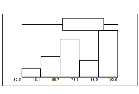
The long left whisker in the box plot is reflected in the left side of the histogram. The spread of the exam scores in the lower 50% is greater (73 - 33 = 40) than the spread in the upper 50% (100 - 73 = 27). The histogram, box plot, and chart all reflect this. There are a substantial number of A and B grades (80s, 90s, and 100). The histogram clearly shows this. The box plot shows us that the middle 50% of the exam scores (IQR = 29) are Ds, Cs, and Bs. The box plot also shows us that the lower 25% of the exam scores are Ds and Fs.
#ofSTDEVs is often called a "z-score"; we can use the symbol z. In symbols, the formulas become:
| Sample | = + z s | |
| Population | = + z |
Two students, John and Ali, from different high schools, wanted to find out who had the highest G.P.A. when compared to his school. Which student had the highest G.P.A. when compared to his school?
| Student | GPA | School Mean GPA | School Standard Deviation |
|---|---|---|---|
| John | 2.85 | 3.0 | 0.7 |
| Ali | 77 | 80 | 10 |
For each student, determine how many standard deviations (#ofSTDEVs) his GPA is away from the average, for his school. Pay careful attention to signs when comparing and interpreting the answer.
;
For John,
For Ali,
John has the better G.P.A. when compared to his school because his G.P.A. is 0.21 standard deviations
below his school's mean while Ali's G.P.A. is 0.3 standard deviations
below his school's mean.
John's z-score of −0.21 is higher than Ali's z-score of −0.3 . For GPA, higher values are better, so we conclude that John has the better GPA when compared to his school.
The following lists give a few facts that provide a little more insight into what the standard deviation tells us about the distribution of the data.
**With contributions from Roberta Bloom

Notification Switch
Would you like to follow the 'Collaborative statistics (with edits: teegarden)' conversation and receive update notifications?