| << Chapter < Page | Chapter >> Page > |
Visit this website to read “The Federal Reserve Bank of Cleveland’s Economic Commentary: A New Approach to Gauging Inflation Expectations” by Joseph G. Haubrich for more information about how expected inflation is forecast.
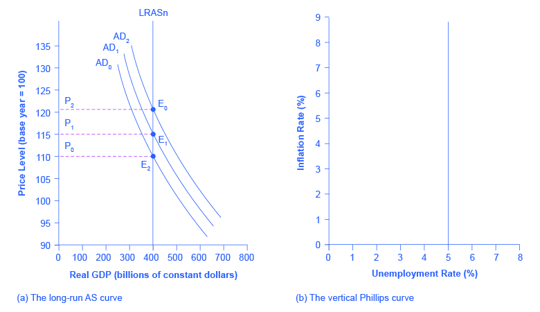
The Keynesian Perspective introduced the Phillips curve and explained how it is derived from the aggregate supply curve. The short run upward sloping aggregate supply curve implies a downward sloping Phillips curve; thus, there is a tradeoff between inflation and unemployment in the short run. By contrast, a neoclassical long-run aggregate supply curve will imply a vertical shape for the Phillips curve, indicating no long run tradeoff between inflation and unemployment. [link] (a) shows the vertical AS curve, with three different levels of aggregate demand, resulting in three different equilibria, at three different price levels. At every point along that vertical AS curve, potential GDP and the rate of unemployment remains the same. Assume that for this economy, the natural rate of unemployment is 5%. As a result, the long-run Phillips curve relationship, shown in [link] (b), is a vertical line, rising up from 5% unemployment, at any level of inflation. Read the following Work It Out feature for additional information on how to interpret inflation and unemployment rates.

Suppose that you have collected data for years on the rates of inflation and unemployment and recorded them in a table, such as [link] . How do you interpret that information?
| Year | Inflation Rate | Unemployment Rate |
|---|---|---|
| 1970 | 2% | 4% |
| 1975 | 3% | 3% |
| 1980 | 2% | 4% |
| 1985 | 1% | 6% |
| 1990 | 1% | 4% |
| 1995 | 4% | 2% |
| 2000 | 5% | 4% |
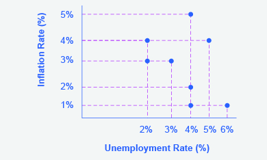
Step 1. Plot the data points in a graph with inflation rate on the vertical axis and unemployment rate on the horizontal axis. Your graph will appear similar to
[link] .
Inflation rates

Step 2. What patterns do you see in the data? You should notice that there are years when unemployment falls but inflation rises, and other years where unemployment rises and inflation falls.
Step 3. Can you determine the natural rate of unemployment from the data or from the graph? As you analyze the graph, it appears that the natural rate of unemployment lies at 4%; this is the rate that the economy appears to adjust back to after an apparent change in the economy. For example, in 1975 the economy appeared to have an increase in aggregate demand; the unemployment rate fell to 3% but inflation increased from 2% to 3%. By 1980, the economy had adjusted back to 4% unemployment and the inflation rate had returned to 2%. In 1985, the economy looks to have suffered a recession as unemployment rose to 6% and inflation fell to 1%. This would be consistent with a decrease in aggregate demand. By 1990, the economy recovered back to 4% unemployment, but at a lower inflation rate of 1%. In 1995 the economy again rebounded and unemployment fell to 2%, but inflation increased to 4%, which is consistent with a large increase in aggregate demand. The economy adjusted back to 4% unemployment but at a higher rate of inflation of 5%. Then in 2000, both unemployment and inflation increased to 5% and 4%, respectively.
Step 4. Do you see the Phillips curve(s) in the data? If we trace the downward sloping trend of data points, we could see a short-run Phillips curve that exhibits the inverse tradeoff between higher unemployment and lower inflation rates. If we trace the vertical line of data points, we could see a long-run Phillips curve at the 4% natural rate of unemployment.

Notification Switch
Would you like to follow the 'University of houston downtown: macroeconomics' conversation and receive update notifications?