<< Chapter < Page Chapter >> Page >
This module gives a brief introduction to the communications channel, which is modeled here as a linear filtering plus an additive noise.

The effects of signal propagation are usually modeled as:

This figure is comprised of three object. The first, on the left, is a graph with horizontal axis f and vertical axis |S(f)|. The graph contains two boxes, one in the second and one in the first quadrant, of equal height and width. The base of both boxes sit on the horizontal axis. The second, in the middle,  is a flowchart titled the communications channel. the chart begins on the left with the expression s(t). To the right of this is an arrow pointing to the right at a boxed expression, H(f). to the right of this is an arrow pointing to the right at a circle with a plus sign. The arrow is labeled x(t). Above the circle with the plus sign is an expression ω(t). This expression also points at the circle with the plus sign with an arrow pointing down. To the right of the circle is an arrow pointing to the right at the expression r(t). The third object is a graph with horizontal axis f and vertical axis |R(f)|. The graph is titled received signal. The graph contains two shapes. The shapes are identical, although flipped horizontally. They consist of two vertical lines, with a small sinusoidal wave connecting the lines together. Along the horizontal axis is a teal shaded line. This figure is comprised of three object. The first, on the left, is a graph with horizontal axis f and vertical axis |S(f)|. The graph contains two boxes, one in the second and one in the first quadrant, of equal height and width. The base of both boxes sit on the horizontal axis. The second, in the middle,  is a flowchart titled the communications channel. the chart begins on the left with the expression s(t). To the right of this is an arrow pointing to the right at a boxed expression, H(f). to the right of this is an arrow pointing to the right at a circle with a plus sign. The arrow is labeled x(t). Above the circle with the plus sign is an expression ω(t). This expression also points at the circle with the plus sign with an arrow pointing down. To the right of the circle is an arrow pointing to the right at the expression r(t). The third object is a graph with horizontal axis f and vertical axis |R(f)|. The graph is titled received signal. The graph contains two shapes. The shapes are identical, although flipped horizontally. They consist of two vertical lines, with a small sinusoidal wave connecting the lines together. Along the horizontal axis is a teal shaded line.

where

H ( f ) : linear filtering due to multipath propagation
w ( t ) : additive noise/interference.

Noise/interference sources include:

  • electronic circuitry (“thermal/shot noise” or “quantization noise”); usually broadband,
  • other comm systems (“multi-access interference” or “co-channel interference”); broadband or narrowband.

SNR can be improved with appropriate filtering at receiver:

  • signal-to-noise ratio (SNR) = signal energy noise energy = E s E n
  • roughly speaking, average SNR can be improved by filtering out the frequencies dominated by noise:

This figure is comprised of two graphs, both plotting the horizontal axis as f. The first is titled before filtering, and contains two trapezoids, one in the second quadrant and one in the first, with their base along the horizontal axis. There is one long horizontal shaded teal region, and two smaller vertical shaded teal regions that cross through the top of the trapezoid. The second graph is labeled after filtering, and contains the same trapezoid shapes, except separated into one triangle on the inside and one trapezoid with a vertical side. Inside the shaded trapezoid is the same teal stripe, except that it is confined to the trapezoid itself. This figure is comprised of two graphs, both plotting the horizontal axis as f. The first is titled before filtering, and contains two trapezoids, one in the second quadrant and one in the first, with their base along the horizontal axis. There is one long horizontal shaded teal region, and two smaller vertical shaded teal regions that cross through the top of the trapezoid. The second graph is labeled after filtering, and contains the same trapezoid shapes, except separated into one triangle on the inside and one trapezoid with a vertical side. Inside the shaded trapezoid is the same teal stripe, except that it is confined to the trapezoid itself.

Filtering due to multipath propagation

The signal may propagate along paths with different lengths:
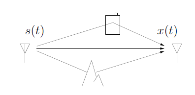
This figure is one flowchart showing movement between different shapes. On the left is a signal tower labeled s(t). From this signal are three arrows. One moves directly to a signal on the right, labeled x(t). One arrow moves above through a shape that looks like a battery, then moves back down to the x(t) signal. The third moves down through something that looks like a mountain and continues over to the x(t) signal. This figure is one flowchart showing movement between different shapes. On the left is a signal tower labeled s(t). From this signal are three arrows. One moves directly to a signal on the right, labeled x(t). One arrow moves above through a shape that looks like a battery, then moves back down to the x(t) signal. The third moves down through something that looks like a mountain and continues over to the x(t) signal.

Since different path lengths imply different path delays:

x ( t ) = c 1 s ( t - τ 1 ) + c 2 s ( t - τ 2 ) + + c N s ( t - τ N ) ,

which can be written as x ( t ) = s ( t ) * h ( t ) for

h ( τ ) = c 1 δ ( τ - τ 1 ) + c 2 δ ( τ - τ 2 ) + + c N δ ( τ - τ N ) .

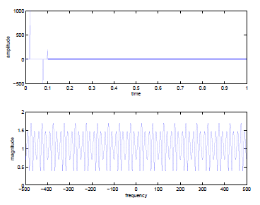
The result is an | H ( f ) | that varies with f , implying frequency-dependent signal attenuation:

t_max = 1; Ts = 1/1000;c1 = 1; tau1 = 0.02; c2 = -0.5; tau2 = 0.08;c3 = 0.2; tau3 = 0.10; h = zeros(1,t_max/Ts);h(tau1/Ts) = c1/Ts; h(tau2/Ts) = c2/Ts;h(tau3/Ts) = c3/Ts; plottf(h,Ts); This figure is comprised of two graphs. The first graph plots time on the horizontal axis, and amplitude on the vertical axis. The horizontal values range from 0 to 1 in increments of 0.1. The vertical values range from -500 to 1000 in increments of 500. The graph is mostly horizontal across amplitude = 0, except or one large peak at 0.002, one large trough at 0.009, and one small peak at 0.1. The second graph plots horizontal axis frequency and vertical axis magnitude. The horizontal axis ranges in value from -500 to 500 in increments of 100. The vertical axis ranges in value from 0 to 2 in increments of 0.5. The graph consists of a pattern of waves. Two waves with amplitudes of 0.4, then one wave with an amplitude of 0.6. These waves are centered about magnitude = 1. This figure is comprised of two graphs. The first graph plots time on the horizontal axis, and amplitude on the vertical axis. The horizontal values range from 0 to 1 in increments of 0.1. The vertical values range from -500 to 1000 in increments of 500. The graph is mostly horizontal across amplitude = 0, except or one large peak at 0.002, one large trough at 0.009, and one small peak at 0.1. The second graph plots horizontal axis frequency and vertical axis magnitude. The horizontal axis ranges in value from -500 to 500 in increments of 100. The vertical axis ranges in value from 0 to 2 in increments of 0.5. The graph consists of a pattern of waves. Two waves with amplitudes of 0.4, then one wave with an amplitude of 0.6. These waves are centered about magnitude = 1.
Get Jobilize Job Search Mobile App in your pocket Now!

Get it on Google Play Download on the App Store Now


Source:  OpenStax, Introduction to analog and digital communications. OpenStax CNX. Sep 14, 2009 Download for free at http://cnx.org/content/col10968/1.2
Google Play and the Google Play logo are trademarks of Google Inc.

Notification Switch

Would you like to follow the 'Introduction to analog and digital communications' conversation and receive update notifications?

Ask