-
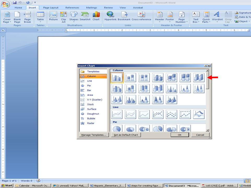
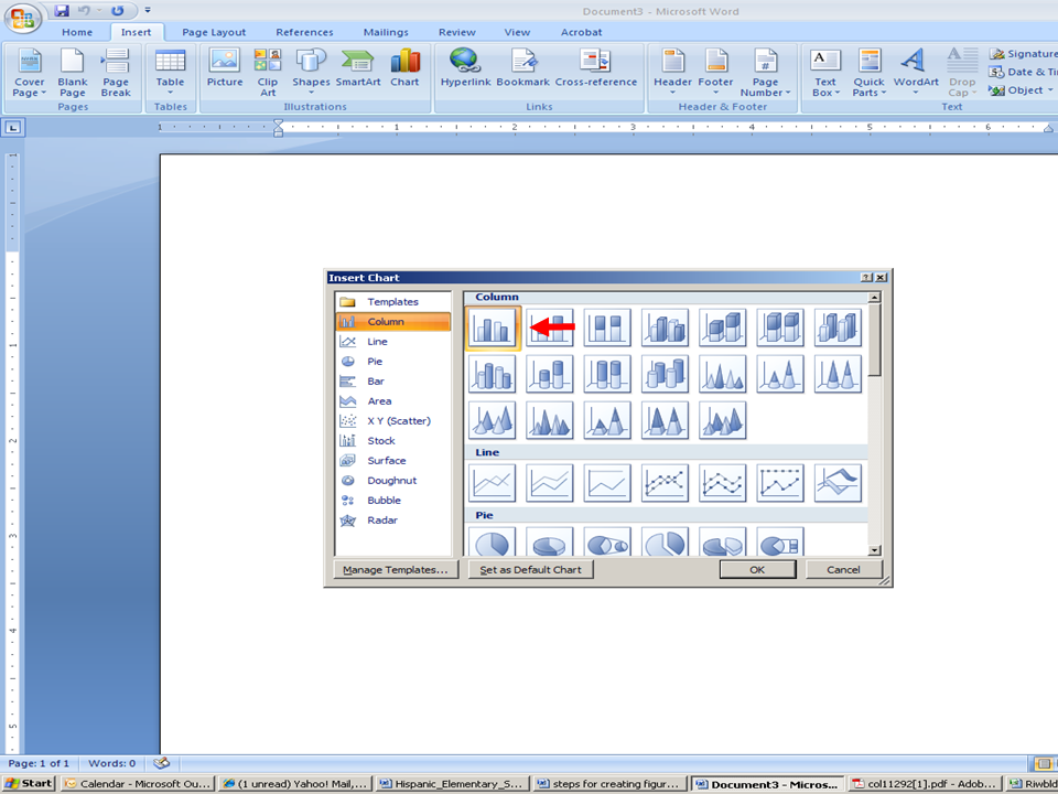
* Click on the actual “chart”
-
* Click OK

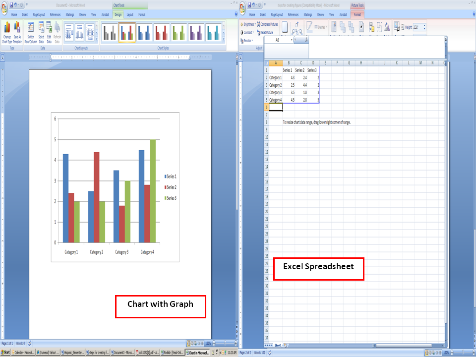
Two screens will “pop” up. A
chart with graphs and an excel spreadsheet

***** Make sure to continue to SAVE your work!!!!
Step two
Using the excel spreadsheet, create the categories and series, depending upon your information.
-
* You can use your SPSS output data (mean scores) to input data
-
* For example, if you have a table with the following information:
Descriptive statistics for hispanic students taks mathematics passing rates by year
| School Size |
M |
| Very Small Schools |
|
| 2003–2004 |
77.60 |
| 2004–2005 |
76.41 |
| 2005–2006 |
79.02 |
|
2006–2007 |
83.00 |
| 2007–2008 |
83.13 |
| Small Schools |
|
| 2003–2004 |
81.71 |
| 2004–2005 |
79.30 |
| 2005–2006 |
81.94 |
|
2006–2007 |
84.26 |
| 2007–2008 |
85.22 |
| Large Schools |
|
| 2003–2004 |
84.71 |
| 2004–2005 |
81.27 |
| 2005–2006 |
83.34 |
|
2006–2007 |
85.80 |
| 2007–2008 |
86.53 |
-
√ Decide which variables will be the categories and series (the categories will be the title that appears under the graphs&the series will be the key).
-
√ Begin filling in your columns and rows in the excel file.
-
√ The first column will be, using the table information above, will contain the years.
-
√ The second column will be Very Small Schools, the first grouping cited in the table above.
-
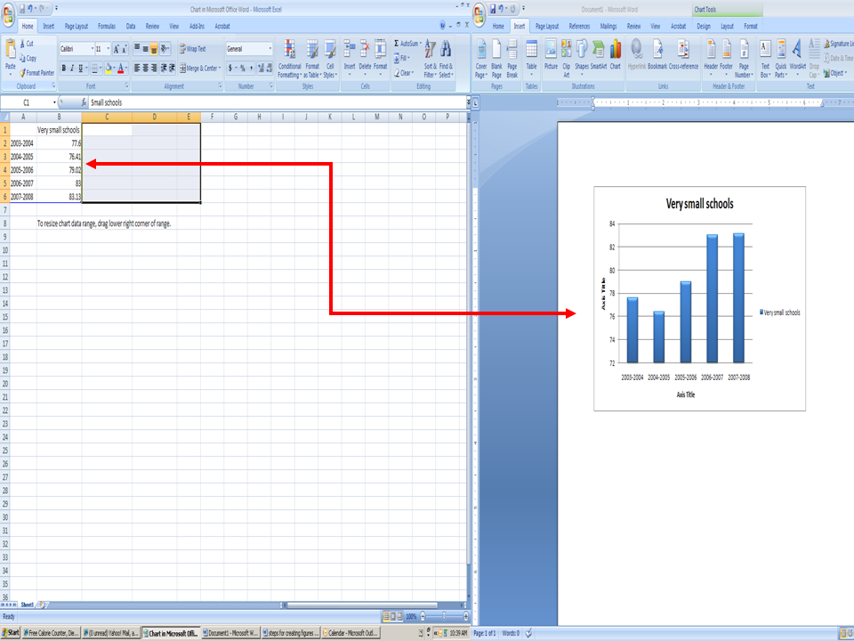
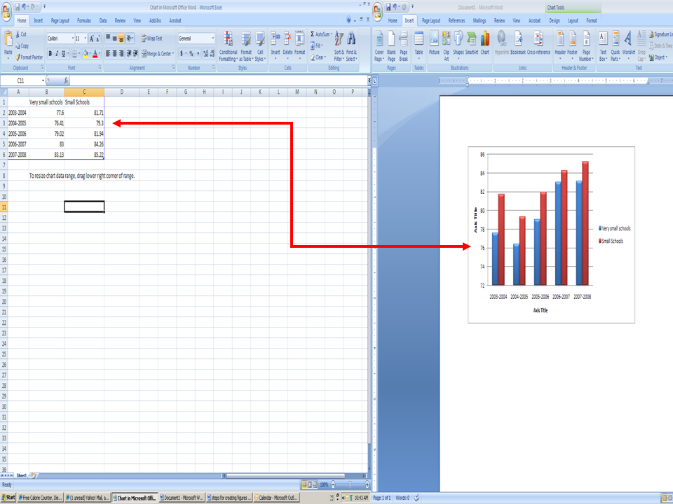
√ This is handled by highlighting each cell and typing the information within the cell, as shown in figure below
- * The illustration below demonstrates step by step how you can fill your columns/rows
- * The first row would be filled (using the table 3 information above) with the very small schools first
- * The graph to the right will instantly appear as you type in the numbers in the row (see arrows)

-
* Next, insert Column "C" with the title "Small School" and insert data (as illustrated in Table 3):
-
* The graph to the right will instantly appear as you type in the numbers in the row (see arrows):

-
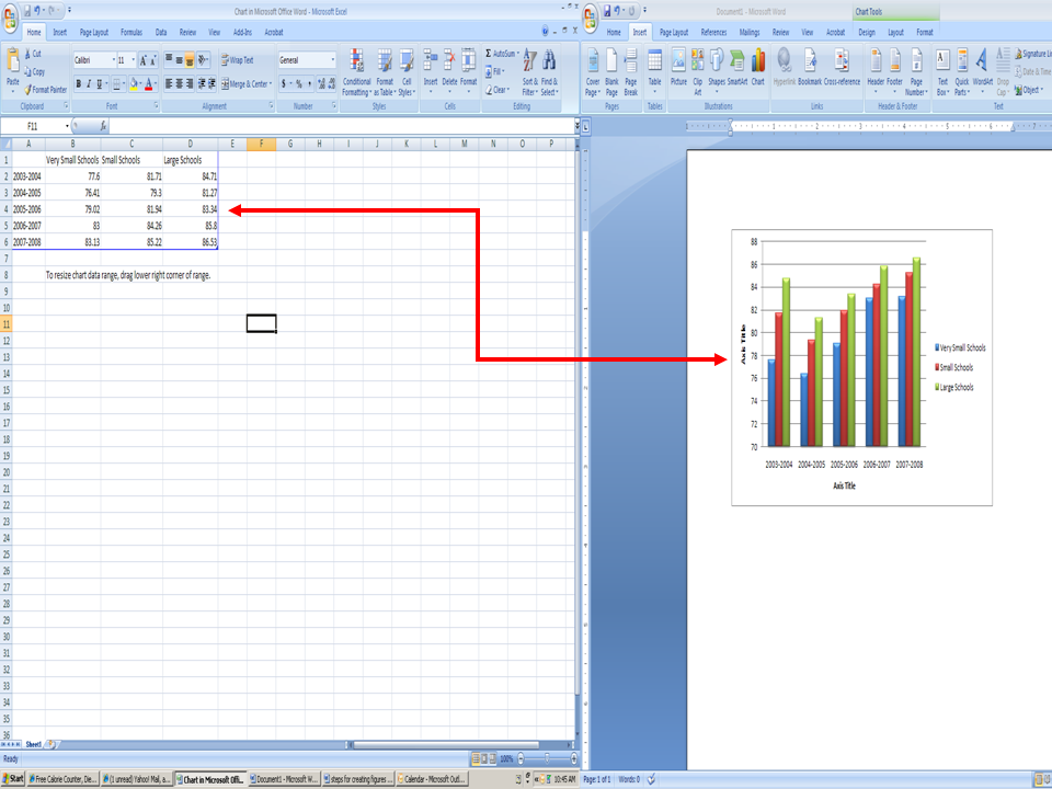
* Next, insert Column "D" with the title "Large School" and insert data (as illustrated in Table 3):
-
* The graph to the right will instantly appear as you type in the numbers in the row (see arrows):

-
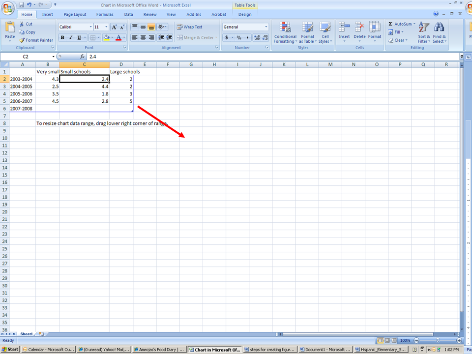
√ You can also make your cells larger or smaller by placing your mouse between the cells until you are able to move the lines over:

-
√ You can switch back and forth from the excel spreadsheet to the chart, using the tabs on the bottom of your excel sheet
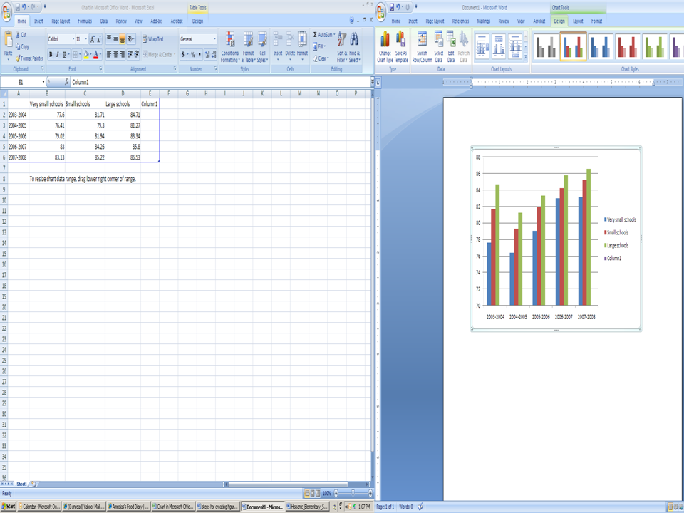
After inputting your information, your chart will resemble the following:

Step three
If you decide to change the
color of your chart:
-
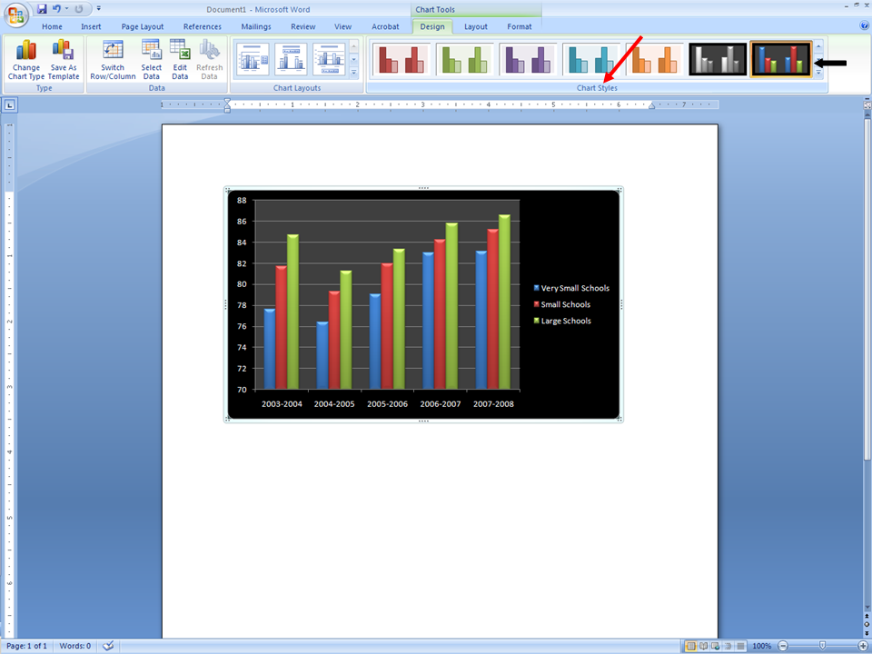
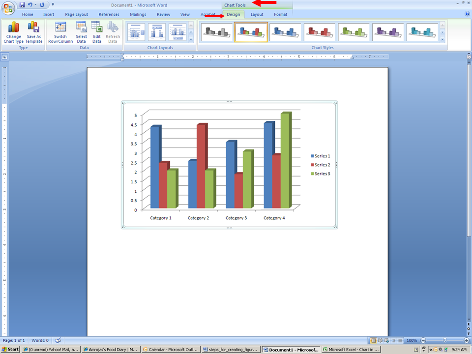
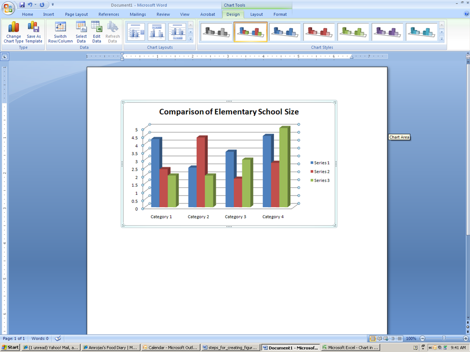
* You must be at your chart and click on the actual graph (this will make Chart Tools appear above in the option area)
-
√ Go to Chart Tools
-
* Design
-
* “Chart styles”
-
* “Change Chart Type”
-
* Click the down arrow, which will give you many different options
-
* Highlight a chart style

If you decide to change your chart
layout :
-
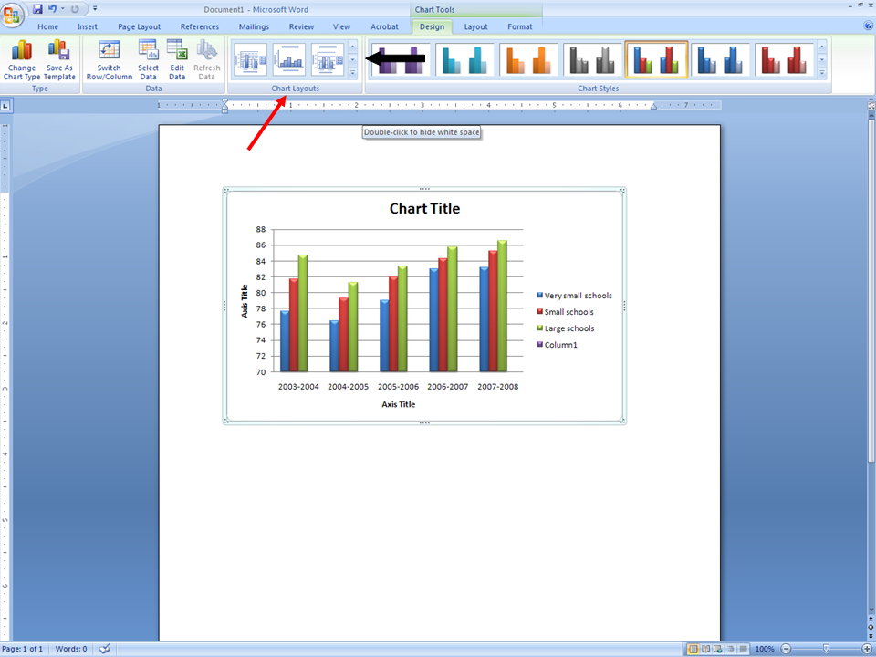
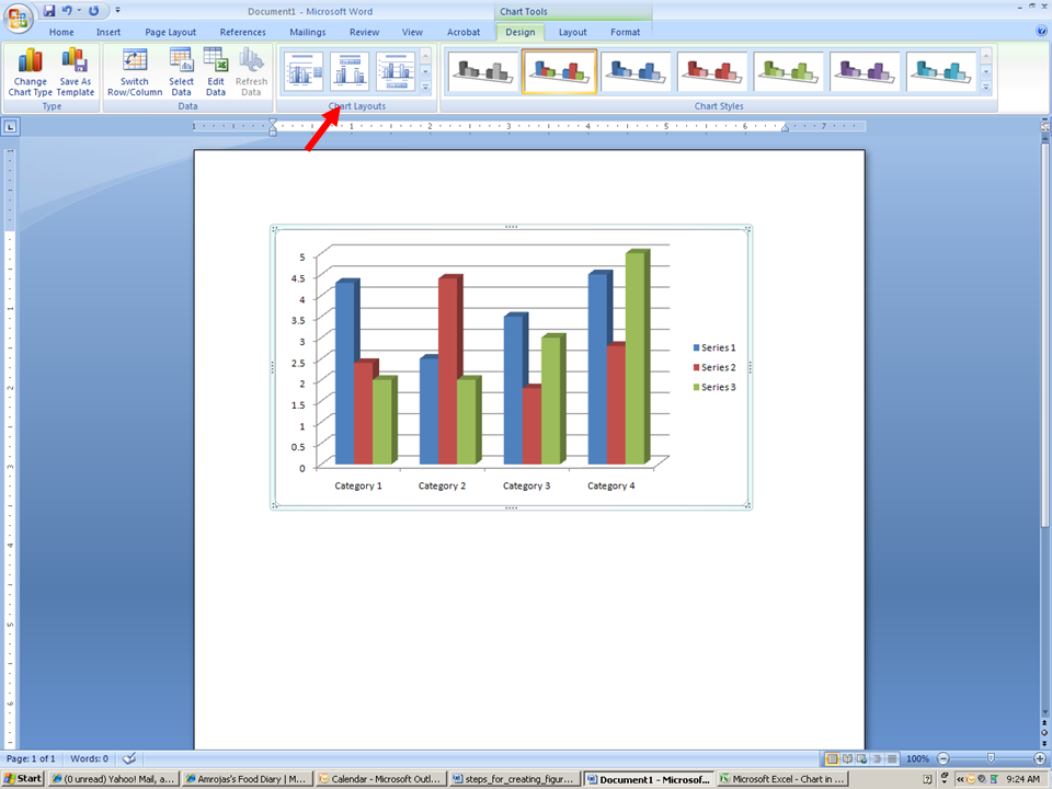
√ Chart Tools
-
* Go to Tab designated “Design”
-
* Chart layouts (not to be confused with tab titled “Layout”)
-
* Click the down arrow, which will give you many different options
Make sure that your cursor is within the actual graph so that chart tools appear. The chart tools will only appear if your cursor is within the graph that you are trying to change.

If you decide to change your design to a different chart:
-
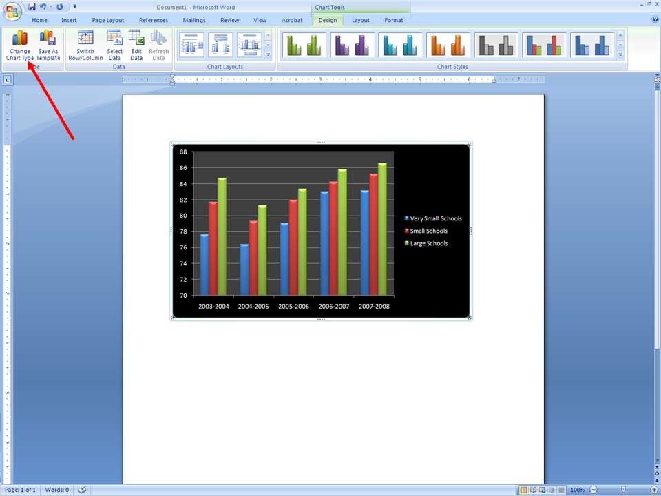
√ Chart Tools
-
* Design
-
* Go to Change Chart Type (furthest left hand icon)
Make sure that your cursor is within the actual graph so that chart tools appear. The chart tools will only appear if your cursor is within the graph that you are trying to change.

-
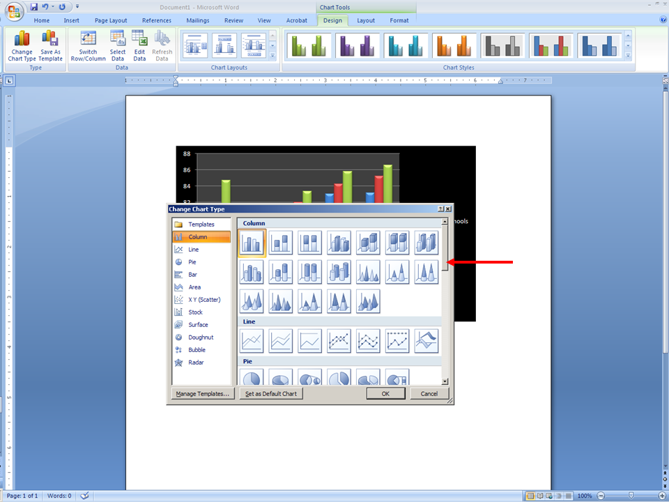
* Choose a different design (your data will transfer to another design)
-
* You can scroll down to choose a different design
-
* Click on design
-
* Click on OK
-
* You can now change color, arrangement of bubbles, using the same steps as mentioned above

If you decide to insert a title at the top of the figure.

-
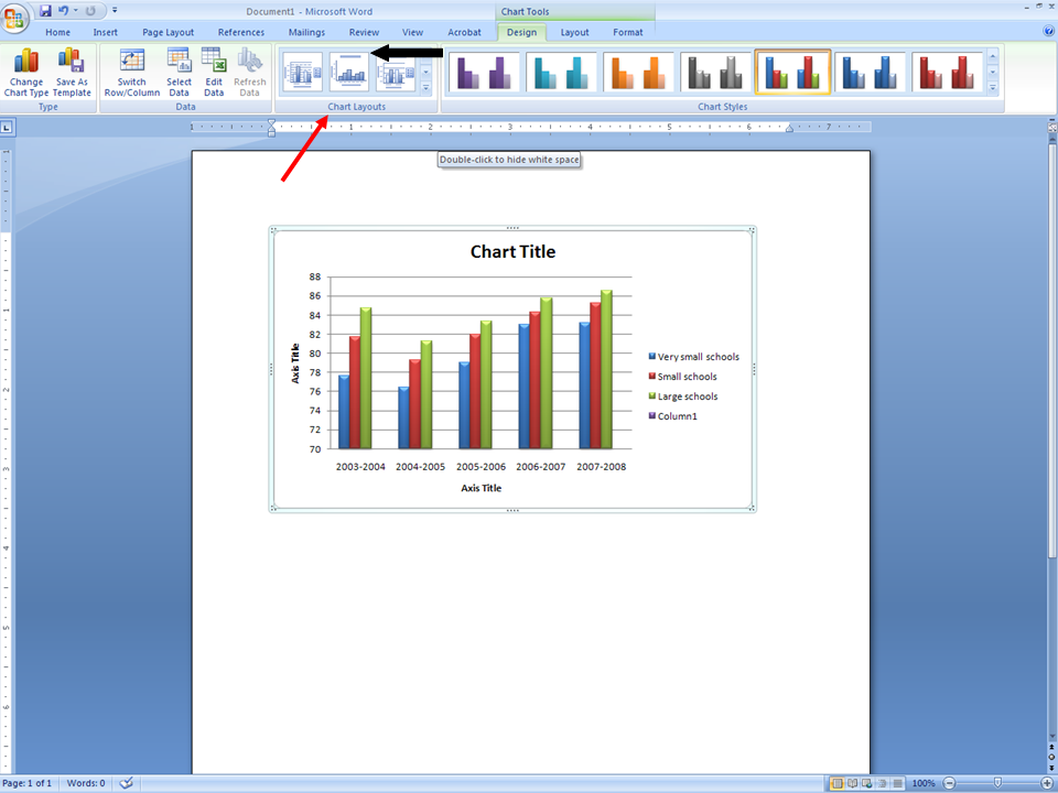
* Go to Change Chart Layouts
(not to be confused with tab titled “Layout”)

-
* Click the down arrow until you see the graph with the “Title”
-
* This will give you many different options for titles and graph layouts

-
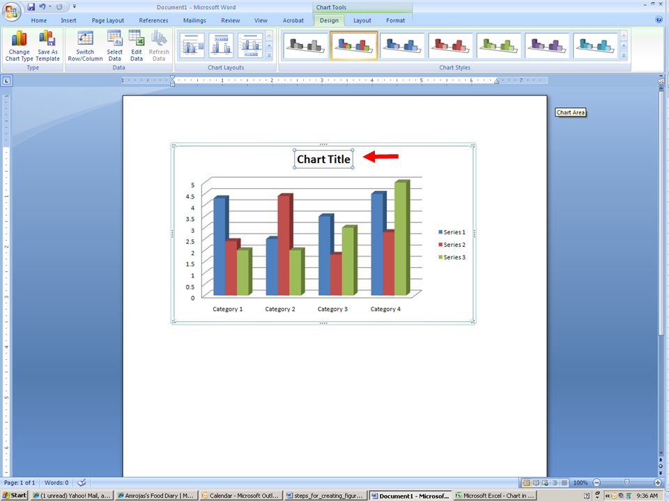
* Click on to Graph section titled Chart Title to enter your new title.

-
* Enter the title of your graph

In APA 6th edition style, you will need to type Figure 1. (if the first figure) and a longer title for the figure immediately below the graph.
