| << Chapter < Page | Chapter >> Page > |
By the end of this section, you will be able to:
Government spending covers a range of services provided by the federal, state, and local governments. When the federal government spends more money than it receives in taxes in a given year, it runs a budget deficit . Conversely, when the government receives more money in taxes than it spends in a year, it runs a budget surplus . If government spending and taxes are equal, it is said to have a balanced budget . For example, in 2009, the U.S. government experienced its largest budget deficit ever, as the federal government spent $1.4 trillion more than it collected in taxes. This deficit was about 10% of the size of the U.S. GDP in 2009, making it by far the largest budget deficit relative to GDP since the mammoth borrowing used to finance World War II.
This section presents an overview of government spending in the United States.
Federal spending in nominal dollars (that is, dollars not adjusted for inflation) has grown by a multiple of more than 38 over the last four decades, from $93.4 billion in 1960 to $3.9 trillion in 2014. Comparing spending over time in nominal dollars is misleading because it does not take into account inflation or growth in population and the real economy. A more useful method of comparison is to examine government spending as a percent of GDP over time.
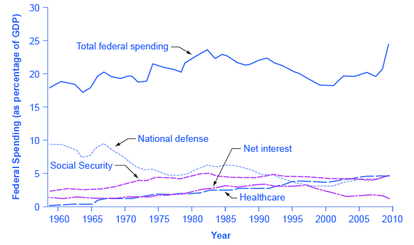
The top line in [link] shows the level of federal spending since 1960, expressed as a share of GDP. Despite a widespread sense among many Americans that the federal government has been growing steadily larger, the graph shows that federal spending has hovered in a range from 18% to 22% of GDP most of the time since 1960. The other lines in [link] show the major federal spending categories: national defense, Social Security, health programs, and interest payments. From the graph, we see that national defense spending as a share of GDP has generally declined since the 1960s, although there were some upward bumps in the 1980s buildup under President Ronald Reagan and in the aftermath of the terrorist attacks on September 11, 2001. In contrast, Social Security and healthcare have grown steadily as a percent of GDP. Healthcare expenditures include both payments for senior citizens (Medicare), and payments for low-income Americans (Medicaid). Medicaid is also partially funded by state governments. Interest payments are the final main category of government spending shown in the figure.


Notification Switch
Would you like to follow the 'Macroeconomics' conversation and receive update notifications?