| << Chapter < Page | Chapter >> Page > |
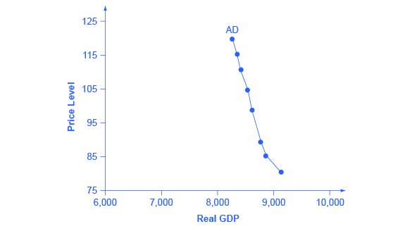
[link] presents an aggregate demand (AD) curve. Just like the aggregate supply curve, the horizontal axis shows real GDP and the vertical axis shows the price level. The AD curve slopes down, which means that increases in the price level of outputs lead to a lower quantity of total spending. The reasons behind this shape are related to how changes in the price level affect the different components of aggregate demand. The following components make up aggregate demand: consumption spending (C), investment spending (I), government spending (G), and spending on exports (X) minus imports (M): C + I + G + X – M.

The wealth effect holds that as the price level increases, the buying power of savings that people have stored up in bank accounts and other assets will diminish, eaten away to some extent by inflation. Because a rise in the price level reduces people’s wealth, consumption spending will fall as the price level rises.
The interest rate effect is that as prices for outputs rise, the same purchases will take more money or credit to accomplish. This additional demand for money and credit will push interest rates higher. In turn, higher interest rates will reduce borrowing by businesses for investment purposes and reduce borrowing by households for homes and cars—thus reducing consumption and investment spending.
The foreign price effect points out that if prices rise in the United States while remaining fixed in other countries, then goods in the United States will be relatively more expensive compared to goods in the rest of the world. U.S. exports will be relatively more expensive, and the quantity of exports sold will fall. U.S. imports from abroad will be relatively cheaper, so the quantity of imports will rise. Thus, a higher domestic price level, relative to price levels in other countries, will reduce net export expenditures.
Truth be told, among economists all three of these effects are controversial, in part because they do not seem to be very large. For this reason, the aggregate demand curve in [link] slopes downward fairly steeply; the steep slope indicates that a higher price level for final outputs reduces aggregate demand for all three of these reasons, but that the change in the quantity of aggregate demand as a result of changes in price level is not very large.
Read the following Work It Out feature to learn how to interpret the AD/AS model. In this example, aggregate supply, aggregate demand, and the price level are given for the imaginary country of Xurbia.
[link] shows information on aggregate supply, aggregate demand, and the price level for the imaginary country of Xurbia. What information does [link] tell you about the state of the Xurbia’s economy? Where is the equilibrium price level and output level (this is the SR macroequilibrium)? Is Xurbia risking inflationary pressures or facing high unemployment? How can you tell?
| Price Level | Aggregate Demand | Aggregate Supply |
|---|---|---|
| 110 | $700 | $600 |
| 120 | $690 | $640 |
| 130 | $680 | $680 |
| 140 | $670 | $720 |
| 150 | $660 | $740 |
| 160 | $650 | $760 |
| 170 | $640 | $770 |
To begin to use the AD/AS model, it is important to plot the AS and AD curves from the data provided. What is the equilibrium?
Step 1. Draw your x- and y-axis. Label the x-axis Real GDP and the y-axis Price Level.
Step 2. Plot AD on your graph.
Step 3. Plot AS on your graph.
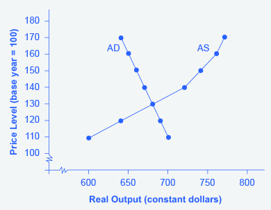
Step 4. Look at [link] which provides a visual to aid in your analysis.

Step 5. Determine where AD and AS intersect. This is the equilibrium with price level at 130 and real GDP at $680.
Step 6. Look at the graph to determine where equilibrium is located. We can see that this equilibrium is fairly far from where the AS curve becomes near-vertical (or at least quite steep) which seems to start at about $750 of real output. This implies that the economy is not close to potential GDP. Thus, unemployment will be high. In the relatively flat part of the AS curve, where the equilibrium occurs, changes in the price level will not be a major concern, since such changes are likely to be small.
Step 7. Determine what the steep portion of the AS curve indicates. Where the AS curve is steep, the economy is at or close to potential GDP.
Step 8. Draw conclusions from the given information:

Notification Switch
Would you like to follow the 'Macroeconomics' conversation and receive update notifications?