| << Chapter < Page | Chapter >> Page > |

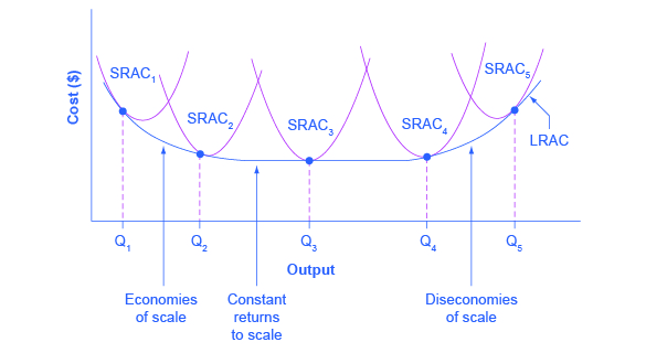
The long-run average cost curve shows the cost of producing each quantity in the long run, when the firm can choose its level of fixed costs and thus choose which short-run average costs it desires. If the firm plans to produce in the long run at an output of Q 3 , it should make the set of investments that will lead it to locate on SRAC 3 , which allows producing q 3 at the lowest cost. A firm that intends to produce Q 3 would be foolish to choose the level of fixed costs at SRAC 2 or SRAC 4 . At SRAC 2 the level of fixed costs is too low for producing Q 3 at lowest possible cost, and producing q 3 would require adding a very high level of variable costs and make the average cost very high. At SRAC 4 , the level of fixed costs is too high for producing q 3 at lowest possible cost, and again average costs would be very high as a result.
The shape of the long-run cost curve, as drawn in [link] , is fairly common for many industries. The left-hand portion of the long-run average cost curve, where it is downward- sloping from output levels Q 1 to Q 2 to Q 3 , illustrates the case of economies of scale. In this portion of the long-run average cost curve, larger scale leads to lower average costs. This pattern was illustrated earlier in [link] .
In the middle portion of the long-run average cost curve, the flat portion of the curve around Q 3 , economies of scale have been exhausted. In this situation, allowing all inputs to expand does not much change the average cost of production, and it is called constant returns to scale . In this range of the LRAC curve, the average cost of production does not change much as scale rises or falls. The following Clear it Up feature explains where diminishing marginal returns fit into this analysis.
The concept of economies of scale, where average costs decline as production expands, might seem to conflict with the idea of diminishing marginal returns, where marginal costs rise as production expands. But diminishing marginal returns refers only to the short-run average cost curve, where one variable input (like labor) is increasing, but other inputs (like capital) are fixed. Economies of scale refers to the long-run average cost curve where all inputs are being allowed to increase together. Thus, it is quite possible and common to have an industry that has both diminishing marginal returns when only one input is allowed to change, and at the same time has increasing or constant economies of scale when all inputs change together to produce a larger-scale operation.

Notification Switch
Would you like to follow the 'Principles of economics' conversation and receive update notifications?