<< Chapter < Page Chapter >> Page >
By the end of this section, you will be able to:
  • Explain the Phillips curve, noting its impact on the theories of Keynesian economics
  • Graph a Phillips curve
  • Identify factors that cause the instability of the Phillips curve
  • Analyze the Keynesian policy for reducing unemployment and inflation

The simplified AD/AS model that we have used so far is fully consistent with Keynes’s original model. More recent research, though, has indicated that in the real world, an aggregate supply curve is more curved than the right angle used in this chapter. Rather, the real-world AS curve is very flat at levels of output far below potential (“the Keynesian zone”), very steep at levels of output above potential (“the neoclassical zone”) and curved in between (“the intermediate zone”). This is illustrated in [link] . The typical aggregate supply curve leads to the concept of the Phillips curve.
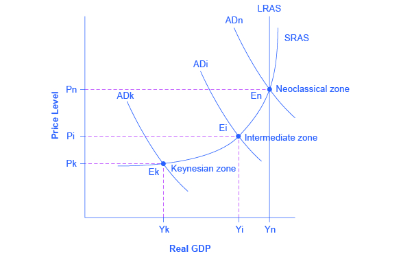
Keynes, neoclassical, and intermediate zones in the aggregate supply curve

The graph shows three aggregate demand curves to represent different zones: the Keynesian zone, the intermediate zone, and the neoclassical zone. The Keynesian zone is farthest to the left as well as the lowest; the intermediate zone is the center of the three curves; the neoclassical is farthest to the right as well as the highest.
Near the equilibrium Ek, in the Keynesian zone at the far left of the SRAS curve, small shifts in AD, either to the right or the left, will affect the output level Yk, but will not much affect the price level. In the Keynesian zone, AD largely determines the quantity of output. Near the equilibrium En, in the neoclassical zone, at the far right of the SRAS curve, small shifts in AD, either to the right or the left, will have relatively little effect on the output level Yn, but instead will have a greater effect on the price level. In the neoclassical zone, the near-vertical SRAS curve close to the level of potential GDP (as represented by the LRAS line) largely determines the quantity of output. In the intermediate zone around equilibrium Ei, movement in AD to the right will increase both the output level and the price level, while a movement in AD to the left would decrease both the output level and the price level.

The discovery of the phillips curve

In the 1950s, A.W. Phillips , an economist at the London School of Economics, was studying the Keynesian analytical framework. The Keynesian theory implied that during a recession inflationary pressures are low, but when the level of output is at or even pushing beyond potential GDP, the economy is at greater risk for inflation. Phillips analyzed 60 years of British data and did find that tradeoff between unemployment and inflation, which became known as a Phillips curve    . [link] shows a theoretical Phillips curve, and the following Work It Out feature shows how the pattern appears for the United States.
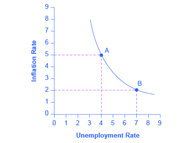
A keynesian phillips curve tradeoff between unemployment and inflation

The graph provides a visual representation of the Phillips curve with a downward-sloping curve.
A Phillips curve illustrates a tradeoff between the unemployment rate and the inflation rate; if one is higher, the other must be lower. For example, point A illustrates an inflation rate of 5% and an unemployment rate of 4%. If the government attempts to reduce inflation to 2%, then it will experience a rise in unemployment to 7%, as shown at point B.

The phillips curve for the united states

Step 1. Go to this website to see the 2005 Economic Report of the President.

Step 2. Scroll down and locate Table B-63 in the Appendices. This table is titled “Changes in special consumer price indexes, 1960–2004.”

Step 3. Download the table in Excel by selecting the XLS option and then selecting the location in which to save the file.

Step 4. Open the downloaded Excel file.

Step 5. View the third column (labeled “Year to year”). This is the inflation rate, measured by the percentage change in the Consumer Price Index.

Step 6. Return to the website and scroll to locate the Appendix Table B-42 “Civilian unemployment rate, 1959–2004.

Step 7. Download the table in Excel.

Step 8. Open the downloaded Excel file and view the second column. This is the overall unemployment rate.

Step 9. Using the data available from these two tables, plot the Phillips curve for 1960–69, with unemployment rate on the x-axis and the inflation rate on the y-axis. Your graph should look like [link] .
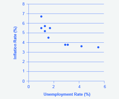
The phillips curve from 1960–1969

The Phillips Curve shows a clear negative relationship between the unemployment rate and the inflation rate over the period 1960-69.
This chart shows the negative relationship between unemployment and inflation.

Step 10. Plot the Phillips curve for 1960–1979. What does the graph look like? Do you still see the tradeoff between inflation and unemployment? Your graph should look like [link] .
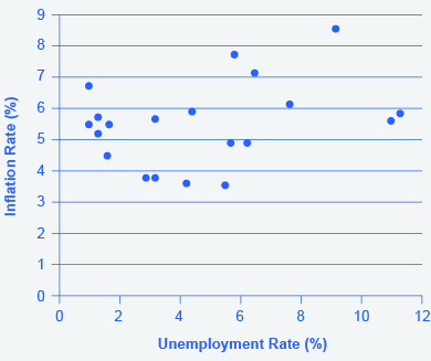
U.s. phillips curve, 1960–1979

The tradeoff between unemployment and inflation appeared to break down during the 1970s as the Phillips Curve shifted out to the right, meaning a given unemployment rate corresponds to a variety of rates of inflation and vice versa.
The tradeoff between unemployment and inflation appeared to break down during the 1970s as the Phillips Curve shifted out to the right.

Over this longer period of time, the Phillips curve appears to have shifted out. There is no tradeoff any more.

Get Jobilize Job Search Mobile App in your pocket Now!

Get it on Google Play Download on the App Store Now


Source:  OpenStax, Principles of macroeconomics for ap® courses. OpenStax CNX. Aug 24, 2015 Download for free at http://legacy.cnx.org/content/col11864/1.2
Google Play and the Google Play logo are trademarks of Google Inc.

Notification Switch

Would you like to follow the 'Principles of macroeconomics for ap® courses' conversation and receive update notifications?

Ask