| << Chapter < Page | Chapter >> Page > |
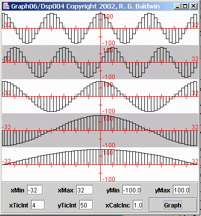
Because the frequency difference between the first two plots in Figure 3 is considerably greater than was the case for the bottom plot of Figure 1 , the frequency of the low frequency component of the third plot in Figure 3 is considerably greater than was the case in Figure 1 .
Later on, we will compute the average value of the third plot in Figure 3 . Ideally, the average value will be zero.
The fourth plot in Figure 3 shows a sinusoid having 16 samples per cycle. The frequency of this sinusoid is double the frequency of the sinusoid in the topplot.
The bottom plot in Figure 3 shows the product of the first and fourth plots. As usual, this time series consists of the sum of two sinusoids whosefrequencies are the sum and the difference of the original frequencies.
We will also compute the average value of the bottom plot later on. Ideally, the average value will be zero.
Consider Figure 4 , which shows five different sampled sinusoids with different frequencies.
| Figure 4. Five Sampled Sinusoids. |
|---|
 |
We may be tempted to say that the average value of a sinusoid is zero. After all, the positive lobes of the sinusoid are shaped exactly like the negativelobes. Therefore, every positive value is offset by a corresponding negative value.
Every positive value is offset by a corresponding negative value only if you compute the average over an even number of cycles of the sinusoid. For example,it is pretty obvious that if you compute the average on the 64 data values shown for the bottom plot in Figure 4 , the result will not be zero. Rather, it will be a positive non-zero value.
Important: While the theoretical average value of a sinusoid is zero, the actual computed average value of a sinusoid will be zero only ifyou include an even number of cycles in the data used to compute the average.
Next we will take a look at the computed average values of the time series from Figures 1 and 3 that were produced by multiplying sinusoids.
The black curve in Figure 5 shows an expanded view of the sinusoidal curve from the top half of the third plot in Figure 1 (recall that the bottom half of that plot was empty, so I didn't include it in Figure 5 ). This curve was the result of multiplying two sinusoids with the same frequency.
| Figure 5. Computed average value of a time series. |
|---|
 |
The red curve in Figure 5 shows the computed average value as a function of the number of points included in the average. In other words, a particular pointon the red curve in Figure 5 represents the average value of all the points on the black curve to the left of and including that point on the black curve.
The blue horizontal line if Figure 5 shows the ideal average value for this situation.
As more and more points are included in the average, the values of the positive and negative peaks on the red curve approach the ideal blue lineasymptotically (except for a slight positive bias, which is the result of the sampling process).

Notification Switch
Would you like to follow the 'Digital signal processing - dsp' conversation and receive update notifications?