| << Chapter < Page | Chapter >> Page > |
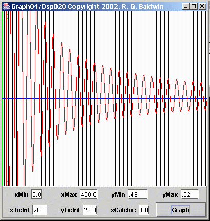
Figure 6 shows a greatly expanded view of the red average values in Figure 5 .
| Figure 6. Expanded average value of a time series. |
|---|
 |
The ideal value for this average is 0.5, and that is the value represented by the blue line. The plot in Figure 6 shows the same horizontal scale as Figure 5 . However, the entire vertical plotting area in Figure 6 represents the values from 0.48 to 0.52.
As you can see, the ideal value is never reached in Figure 6 except at isolated points where the red curve crosses the horizontal line. Even if Iextended the horizontal axis to 1200 or more points, that would continue to be the case.
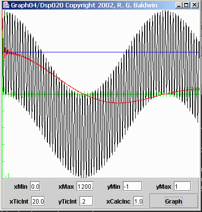
Figure 7 computes and displays the average value of the bottom plot in Figure 2 (recall that this plot shows 1200 points on the horizontal axis, whereas Figure 5 shows only 400 points on the horizontal axis). Recall also that this time series was produced by multiplying two sinusoids having nearly thesame but not exactly the same frequency.
| Figure 7. Computed average value of a time series. |
|---|
 |
As before, the black curve in Figure 7 shows the time series, and the red curve shows the computed average value as a function of the number of pointsincluded in the average.
(In this case, I didn't even bother to show the short axis containing only 400 points. The horizontal axis in Figure 7 contains 1200 points, the same as in Figure 2 .)
In this case, the ideal average value is zero, as indicated by the green horizontal axis. As you can see, even for a 1200-point averaging window, theaverage value deviates significantly from the ideal. We will see the detrimental impact of this problem later when I perform spectral analysis in an attempt toseparate two closely-spaced peaks in the frequency spectrum.
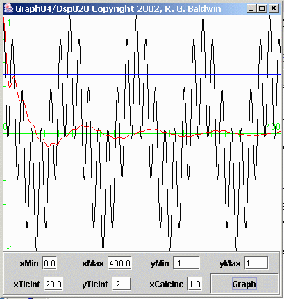
Figure 8 computes and displays the average value of the third plot down from the top in Figure 3 . This plot was produced by multiplying the two sinusoids in the top two plots in Figure 3 .
| Figure 8. Computed average value of a time series. |
|---|
 |
As before, the black curve in Figure 8 represents the time series, and the red curve represents the computed average value of the time series as a functionof the number of points included in the average.
For this case also, the ideal average value is zero, as represented by the green horizontal axis. The positive and negative peaks in the red average valuecan be seen to approach the ideal value asymptotically within the 400 horizontal points plotted in Figure 8 .
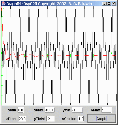
Figure 9 computes and displays the average value of the bottom plot in Figure 3 . This time series was produced by multiplying the top plot in Figure 3 by the fourth plot in Figure 3 .
| Figure 9. Computed average value of a time series. |
|---|
 |
Once again, the black curve in Figure 9 represents the time series, and the red curve represents the computed average value of the time series as a functionof the number of points included in the average. In this case, the average converges on zero rather nicely within the 400 points included on the horizontalaxis.

Notification Switch
Would you like to follow the 'Digital signal processing - dsp' conversation and receive update notifications?